The Elbetitsa
Coming up with the website logo wasn’t very easy. Putting my face there felt cringy and having just my initials was a safe fallback in case I didn’t come up with anything better. I used to be the type of person who would lose sleep over such things and would halt all progress on the website until I got it right. It sounds like a big deal at first: something that needs to be very well thought out, original, significant, personal, linked to my identity, timeless. This time I went with the flow. It’s just a dumb picture that nobody will spend even a fraction of the energy I spent thinking about it. The internet was proclaimed dead a while ago and practically nobody1 reads anything. On the off chance that a real person is actually on my website, the logo is most likely a filler that people don’t care about as long as it’s not completely missing.
I was preparing lunch, the same kind of salad that I have had for the past 8 years. By now I don’t think about the process, which gives me some quiet 15 minutes where I let my mind wander. I just think about… nothing and everything at the same time. That’s when the bright red label on the plastic cheese box caught my eye:
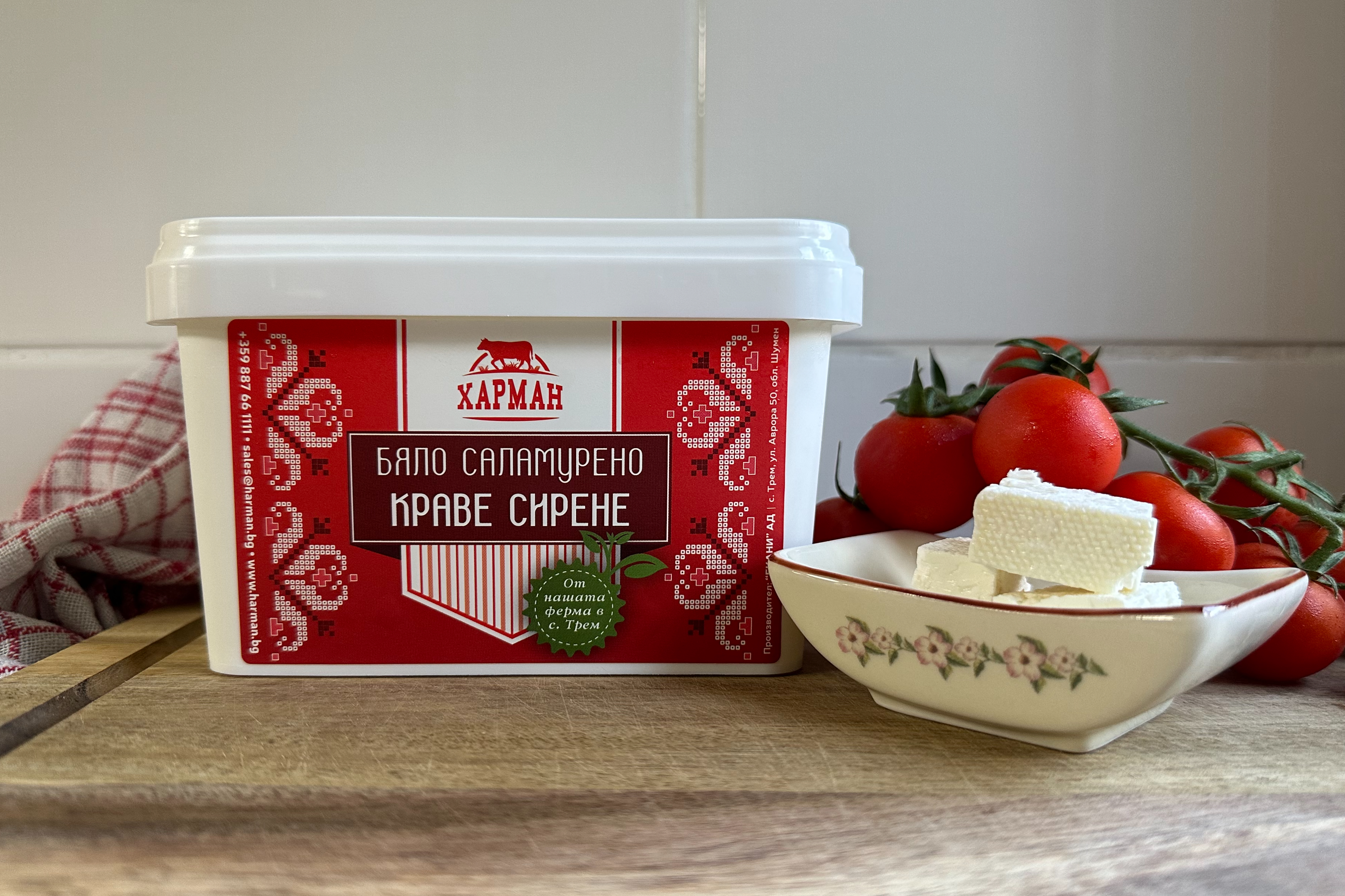
This is a pattern from Bulgaria, where I’m from. People have been using it for:
- garment and tablecloth embroidery
- trinket box lid decoration
- front door or gateway decoration
It’s not only a Bulgarian thing though. You’ll find similar motifs and patterns in Croatia, Estonia, Mongolia, Tibet, and many more. It’s like a tattoo but for your clothes or your home. So I decided that my website is getting a tattoo!
The neurons and synapses that lit up in my brain quickly progressed through:
Symbolic patterns → handcrafted → pixel art!
The Shevitsa being an embroidery lends itself well to pixel art. It’s one of the OG forms of pixel art made of threads 🧵.
I did some light research on which shapes and colors were predominantly used in my area and their symbolic meaning and picked the ones that vibed well. The first version looked like this:

The symbol is called Elbetitsa or simply a double-star shape and it’s one of the symbols associated with the cult of the sun. It stands for harmony and amity and its name roughly means The eight directions of the world. Black and green are for Mother earth and stand for solidity, security, and eternal life. Red symbolizes blood and new life, and as I’m told it would protect my blog from bad magic and being cursed. As a secondary precaution, I’ve turned on SSL in case the symbols don’t…
Fast-forward a couple of weeks to when Googlebot finally crawled the homepage, I checked out how my website is displayed in Google Search and much to my dismay the extra padding that I included in the canvas wasn’t enough and the pixels near the four edges were right on the masked image border. This is what you get when you design a square logo for a round mask. So I made some tweaks and as of Oct 29, 2026, it looks like this:

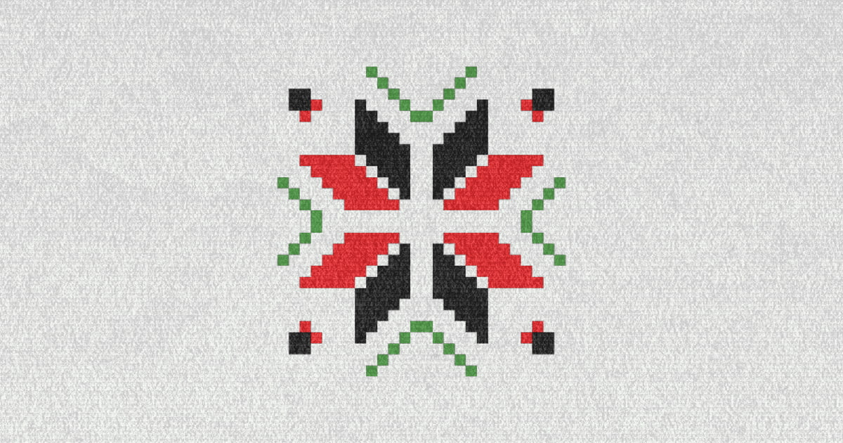
First, I removed the white pixels around the edges and in the center, less is more! If you happen to visit this post from social media or a chat app, chances are you also saw the OpenGraph image, which puts the logo on a nice soft-looking fabric background generated with a Paper shader:
After that, I made a favicon with just the center piece which renders better in a 32x32 box.
Mission successful?
It took me a few days of actual work which includes coming up with the idea, drawing it on an SVG canvas, further refinements, and finally shipping it. A website logo is a fertile ground for procrastination and obsession, eating up precious free time I ought to spend on the real goal: writing. I’d score this 4/5. It would have been 5/5 if I had spent 15 minutes with a pen and paper before hand-coding the <rect> elements and only then discovering that the symmetry is off.
On the earlier list of features I reckon the logo isn’t very original, because these patterns are slapped on practically half of the produce I see on the shelf in my local grocery store. Nor is it significant or linked to my identity… Well kind of - the more I look at it and the more I talk about it the more it starts to feel just right and “mine”. You could say it’s growing on me. Will it be my forever logo? Hard to tell right now, but it’s here to stay for the foreseeable future.
Footnotes
-
Except you! Thank you, kind reader! ↩